| home | interests | travel | java | REVIEWS | links | photos |
|
|
|
Site reviewsThese sites were given to us in class for our evaluation. The main criteria I used for judging the success of a site are:
|
 |
 |
 |
 |
| Amazon this site has a big job to do and does it well. The horizontal navigation bar stretching across the top of the page grounds the user to the complete site. Considering the amount of information it maintains a light and approachable look. It's interactivity works and is useful. |
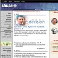
CBC A while back the CBC looked a lot more like a BBC wannabe than they do now. They seem to have used the considerable navigational and typographic strengths of the Beebs and used them well for their own purposes. It's easy on the eye, clean and easy to read through. |
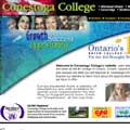
Conestoga College home page. I've included the home and inside page of this site to contrast the shift in navigation when you enter it. I find the home page too cluttered and unfocused. The large diagonal graphic block takes up space without adding anything to its look or function, forcing the text blocks into a crammed space below. The items in reverse in the top bar look like navigation tools but aren't. |
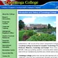
Conestoga College inside page. It's easy to get lost in this site. Considering it represents a college that trains people to do what the site represents, it doesn't reflect a high enough standard of clarity and quality. At one point a page took me right out of the site. The type treatment is perfunctory. |
 |
 |
 |
 |
|
MBA Another horking huge site full of complex information. It all seems very retrievable and aside from the orphaned bar of graphics on the home page, the look is clear and consistent through the pages I viewed. |
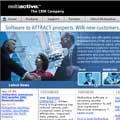
Multi Active I like the drop down bars. But it didn't take long to get lost and have to back click my way out. |
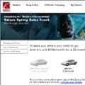
Saturn I can't help it, I love it. It's so clean and clear and easy to get around. Smart navigation. Not all that much content, but it has what it needs. |
Sony This site bugged me. As soon as I moved away from the home page I was in a different, unrelated world. A busy site with so much information I never quite knew where to go next. |
|
|
| home • interests • travel • java • site reviews • links • photos | |
| TOP | |